
Explore Our Colour Collection
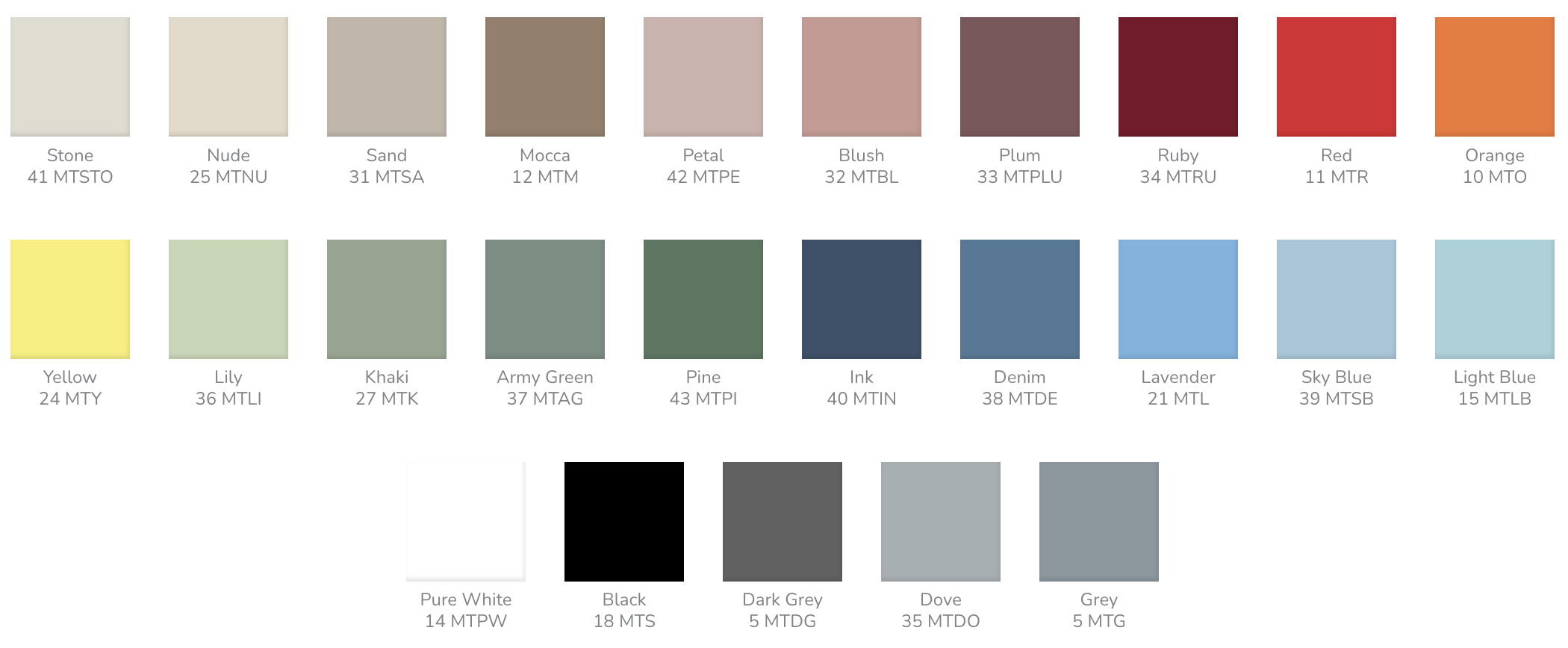
Colour can completely change the way a space feels. It can create calm, add energy, highlight architectural details or connect materials and furniture across an interior.
At CHAT BOARD, colour is an integral part of the design. Our glass whiteboards are available in 25 standard glass colours, making it possible to choose a functional writing surface that complements the surrounding architecture and interior.
From warm neutrals and natural greens to deep blues, reds and expressive accent colours, the collection gives architects, designers and workplaces the freedom to make the whiteboard part of the space rather than simply adding it afterwards.
More than a white whiteboard
A whiteboard does not have to be white.
In meeting rooms, offices and educational environments, writing surfaces often occupy a significant amount of wall space. Their colour therefore has a noticeable impact on the overall interior.
A coloured glass whiteboard can blend naturally with walls, furniture and materials or become a deliberate visual feature.
A subtle neutral can create a calm and understated expression, while a stronger colour can add contrast and personality.
With products such as CLASSIC, colour can be combined with different sizes and formats to create a writing surface suited to the individual space.
Explore 25 standard glass colours
The CHAT BOARD colour collection includes 25 carefully selected standard glass colours, from understated neutrals to stronger statement shades.
This makes it possible to choose a colour according to both the practical function of the board and the character of the interior.
Warm and natural neutrals
For calm and timeless interiors, Stone, Nude, Sand and Mocca provide a warm, natural foundation.
These shades work particularly well alongside wood, stone and warm textiles, allowing the glass surface to become an integrated part of the material palette.
Pure White, Dove, Grey and Dark Grey provide additional neutral options for interiors with a cleaner or more minimal expression.
Soft and expressive reds
Warm colours can introduce character and energy without necessarily dominating the room.
The palette includes Petal, Blush, Plum, Ruby, Red and Orange, creating a spectrum from muted, softer tones to more expressive colours.
Petal and Blush introduce subtle warmth. Plum and Ruby create greater depth, while Red and Orange can become deliberate accents within a more neutral environment.
Greens inspired by nature
Green works particularly well with natural materials such as wood, stone and plants.
The collection ranges from the light Lily through Khaki and Army Green to the deeper Pine.
This makes it possible to use green as either a subtle extension of a natural material palette or a stronger visual element within the room.
From deep blue to soft blue
Blue provides options for both understated and more expressive interiors.
Ink creates a deep, sophisticated expression, while Denim offers a softer blue tone.
Lavender, Sky Blue and Light Blue create a lighter appearance and can work particularly well in spaces where the aim is to introduce colour without making the writing surface feel visually heavy.
A touch of yellow
Yellow provides a clear and energetic accent within the collection.
Against a more neutral interior, it can create contrast and turn the writing surface into an intentional focal point.
Strong colours can be particularly effective on smaller boards or as part of a composition involving several writing surfaces.
Choose a colour that works with your interior
The right whiteboard colour starts with the space around it.
Consider the walls, flooring, furniture, textiles and architectural materials before selecting the glass colour.
In a warm interior with natural wood, shades such as Sand, Mocca or Pine can create a cohesive palette. Ink or Black can provide stronger contrast against lighter surroundings, while Sky Blue, Ruby or Yellow can introduce a more distinctive accent.
The size of the board matters too. A strong colour on a smaller board can work as a subtle accent, while the same colour across a large glass surface will have a much greater impact on the room.
Our guide to choosing the right colour for a glass whiteboard takes a closer look at lighting, contrast, board size and the surrounding interior.
Create harmony or contrast
There are two simple ways to approach colour: harmony or contrast.
For a harmonious interior, choose a glass colour with similar tones to the surrounding materials. Warm neutrals can create a calm composition, while different shades of green or blue can establish a more tonal palette.
For contrast, choose a colour that clearly stands apart from the wall or surrounding furniture.
Ruby can create a strong focal point against a neutral background. Pine can introduce depth to an interior dominated by warm natural materials, while Sky Blue can create a lighter contrast.
Neither approach is inherently better. The important thing is that the colour choice feels intentional.
For a broader look at creating a complete palette, read our guide to choosing colours for your interior.
Combine colours, shapes and formats
Colour does not have to be considered in isolation.
Different shapes and formats create additional opportunities to use colour as part of the interior.
Circular ORBIT and oval AMBIT boards can turn a writing surface into a more distinctive visual element, particularly when several boards or colours are combined.
For larger wall compositions, GALLERY provides another way to integrate glass writing surfaces into the architecture.
This makes it possible to work with colour across individual boards, combinations of boards or larger installations.
Matt or glossy glass?
The finish of the glass also affects how colour is experienced.
Traditional glossy glass reflects light and elements from the surrounding room, giving the surface its characteristic depth.
MATT offers a softer expression with reduced reflections, creating a different visual experience of both the glass and its colour.
The right surface therefore depends on the desired expression as well as lighting conditions within the space.
Bring brand colours into the workspace
Colour can also connect an interior with a company’s visual identity.
Instead of applying a corporate colour across entire walls or large pieces of furniture, functional elements can introduce brand colours in a more considered way.
A glass whiteboard can become one of these elements.
This can work particularly well in meeting rooms, reception areas and collaborative spaces where the board is permanently visible.
Need a specific colour? Choose NCS or RAL
Sometimes the right colour is not part of a standard palette.
A project may need to match an existing material, architectural specification or corporate identity.
For these projects, CHAT BOARD products can be produced in almost any standard NCS or RAL colour suitable for glass.
This gives architects, interior designers and companies greater freedom when a specific colour is required.
For projects where dimensions or other specifications also need to be adapted, explore MADE-TO-MEASURE.
Colour as part of Scandinavian design
At CHAT BOARD, we believe functional objects should contribute to the spaces around them.
A glass whiteboard serves a practical purpose, but its colour, shape, size and surface also influence the interior.
Choose a subtle neutral, introduce a natural green or blue, create contrast with a stronger shade or specify a custom NCS or RAL colour.
With 25 standard glass colours and custom colour options, the writing surface can become a considered part of the interior rather than simply a functional addition.
Explore CHAT BOARD CLASSIC and discover the possibilities of glass, colour and functional design.