
Choosing Colours for Your Interior
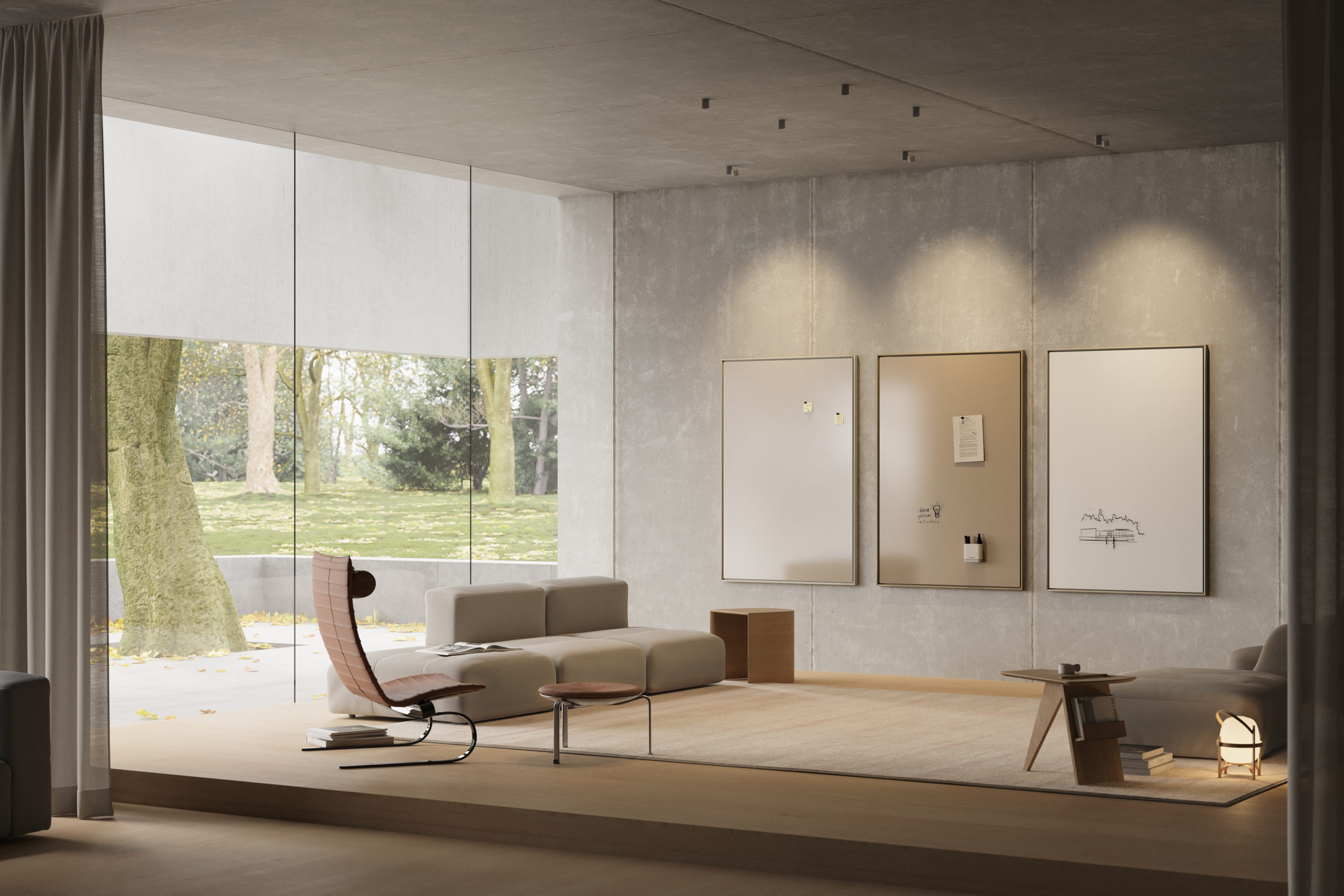
Colour can completely change the way a space feels. Warm shades can make a room feel inviting and comfortable, while cooler tones often create a calm and focused atmosphere. The right colour combination can also connect furniture, walls and accessories to create a more considered interior.
However, creating a successful colour scheme involves more than choosing a few colours you like.
Understanding undertones, contrast, materials and the purpose of the space can help you create an interior where every element works together.
Start with the purpose of the space
Before choosing colours, consider how people will use the room.
A meeting room may need to feel professional and focused, while a creative workspace can benefit from a more energetic atmosphere. Reception areas often need to reflect a company’s visual identity and create a strong first impression.
Think about the mood you want to create before selecting individual colours.
Ask yourself:
- Should the space feel calm or energetic?
- Do you want a warm or cool atmosphere?
- Does the room need to feel formal or relaxed?
- Which existing materials and colours need to remain?
- Should certain elements stand out or blend into the interior?
These questions provide a useful starting point for building a coordinated colour palette.
Understand warm and cool colours
One of the easiest ways to create a balanced interior is to understand the difference between warm and cool colours.
Warm colours include shades with red, orange or yellow undertones. Beige, terracotta, warm brown and many shades of red can add warmth and character to a room.
Cool colours often contain blue, green or violet undertones. They can create a calmer expression and work particularly well in spaces designed for concentration and focus.
Neither group works better than the other. The right choice depends on the atmosphere you want to create and the materials already present in the room.
Pay attention to undertones
Two colours can look similar at first glance but behave very differently when you place them next to each other.
A beige with a yellow undertone may work beautifully with warm oak, while a cooler beige might complement concrete, steel or cooler wood tones.
The same principle applies to whites, greys, greens and almost every other colour.
Instead of looking at each colour individually, compare colours directly with the surrounding materials. Flooring, furniture, textiles and wall finishes can all influence how a colour appears.
Natural and artificial light will affect it too.
Use the 60-30-10 rule as a starting point
The 60-30-10 rule offers a simple framework for creating a balanced colour scheme.
Around 60% of the space uses a dominant colour. Walls and large surfaces often create this foundation.
A secondary colour accounts for approximately 30% and can appear through furniture, curtains, rugs or other larger interior elements.
The final 10% introduces an accent colour through smaller objects and details.
You do not need to follow these proportions precisely. Instead, use the rule as a starting point for creating hierarchy between your colours.
A warm neutral interior, for example, could combine soft beige walls, natural oak furniture and burgundy accents. Another space might use warm white as the dominant colour, muted green as the secondary shade and black details for contrast.
Build your palette around existing materials
Most interior projects do not start with an empty room.
Wood, flooring, stone, metal, textiles and existing furniture already contribute colour to the space. Treat these materials as part of your palette rather than choosing colours independently from them.
Wood plays a particularly important role.
Light oak can introduce warmth without dominating the room, while darker woods create stronger contrast and visual depth. Metals can also change the overall expression. Stainless steel and chrome often feel cooler, while brass and bronze introduce warmer tones.
Looking at the complete material palette helps create a more coherent result.
Decide between harmony and contrast
Colour coordination does not mean that everything needs to match.
A harmonious colour scheme uses shades that share similar characteristics. Combining several warm neutrals, for example, can create a calm and sophisticated interior.
Contrast creates a different effect.
A deep green element against a warm neutral wall will naturally attract attention. Burgundy, dark blue or black can create similar focal points when surrounded by lighter colours.
The amount of contrast should reflect the purpose of the space. A calm meeting room may benefit from subtle variations, while a creative environment can accommodate stronger combinations.
Use colour to create zones
In larger offices and collaborative environments, colour can also help define different areas.
Instead of adding physical walls, you can use changes in colour to visually separate meeting areas, collaborative zones and individual workspaces.
A repeated accent colour can also connect different parts of a building and create a consistent visual identity.
This approach becomes particularly effective when colours appear across several interior elements rather than on walls alone.
Coordinate functional elements with the interior
Practical objects often receive less attention during the design process, but they still contribute to the overall colour scheme.
Writing boards, acoustic solutions, storage, lighting and other functional elements occupy visible space. Their colour can either complement the surrounding interior or create an intentional contrast.
A traditional white writing board, for example, may stand out in an otherwise warm and carefully coordinated room.
A coloured glass whiteboard offers another approach. Choosing a shade that relates to the walls, furniture or brand identity can turn a functional writing surface into part of the interior concept.
This is particularly relevant in meeting rooms and offices where writing surfaces occupy a significant part of the wall.
Consider colour across the entire workplace
Consistency does not require every room to look identical.
Instead, create a core palette and allow individual spaces to interpret it differently.
A workplace might use the same warm neutral foundation throughout the building while introducing different accent colours in meeting rooms, collaborative spaces and social areas.
Repeating selected materials or colours creates visual connections between the spaces without making the interior feel repetitive.
For companies, this also creates an opportunity to incorporate brand colours in a subtle way.
Rather than covering an entire office in corporate colours, selected elements can reference the brand and create a recognisable identity.
Always test colours in the actual space
Screens and printed colour samples cannot show exactly how a colour will appear in a room.
Natural light changes throughout the day, while artificial lighting can make the same colour appear warmer or cooler. Surrounding materials also influence how we perceive a shade.
Whenever possible, compare physical colour samples directly in the space.
View them next to the flooring, walls, furniture and other important materials. Check the colours at different times of day before making the final decision.
This simple step can prevent unexpected colour combinations later in the project.
Creating a coordinated interior with colour
Successful colour coordination comes from looking at the interior as a whole.
Start with the purpose and atmosphere of the room. Consider the existing materials, identify their undertones and build a limited palette around them. From there, use contrast and accent colours to create depth and highlight important elements.
Most importantly, remember that functional products also form part of the visual environment.
At CHAT BOARD, colour plays an important role in the design of our magnetic glass whiteboards. A broad selection of colours makes it possible to coordinate writing surfaces with furniture, materials and other elements of the interior.
Whether the goal is subtle harmony or a stronger contrast, colour can transform a practical writing surface into an integrated part of the space.
Explore the CHAT BOARD colour collection and find the right combination for your interior.