
How to Choose the Right Colour for a Glass Whiteboard
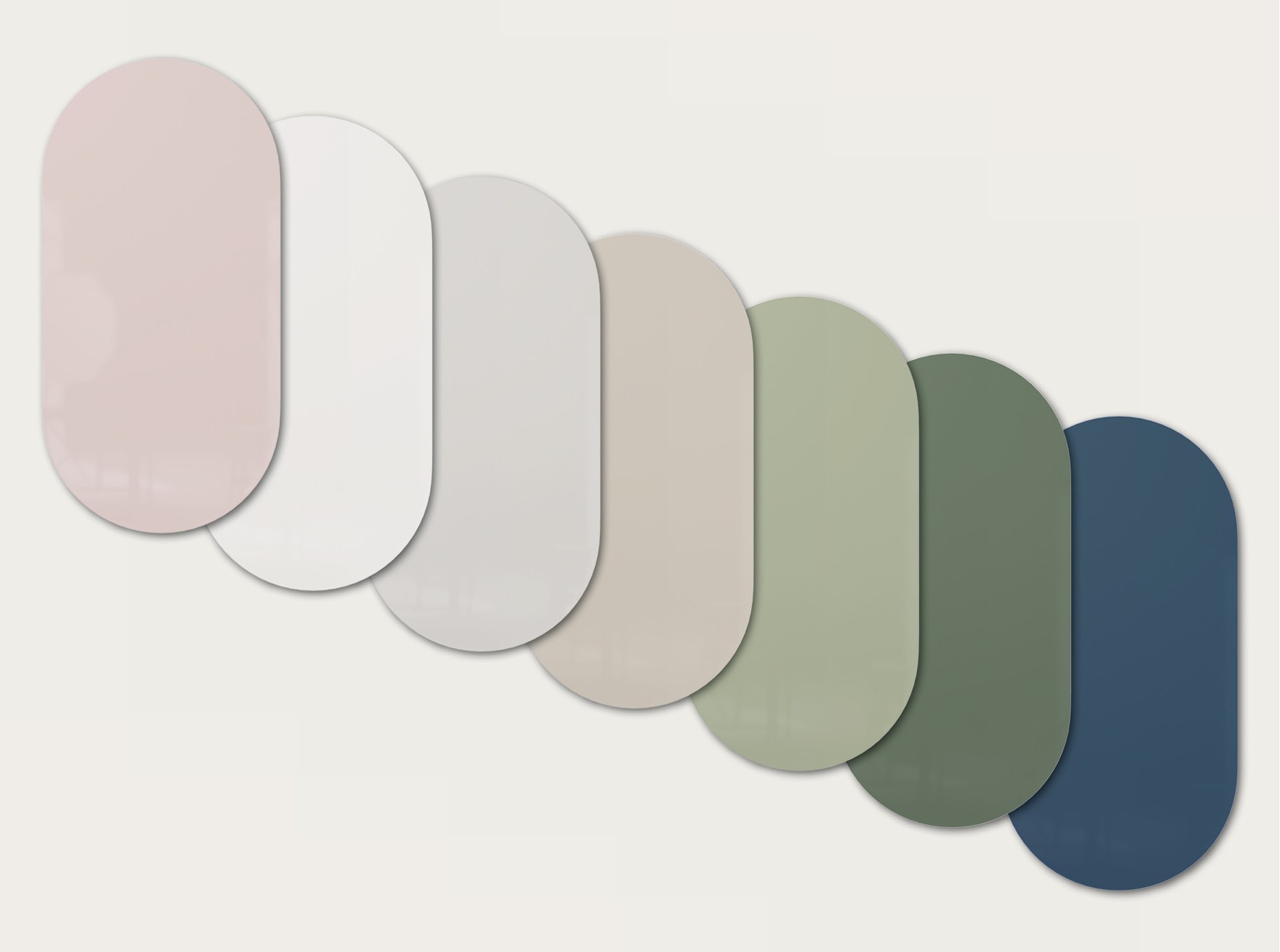
A whiteboard does not have to be white.
One of the advantages of choosing glass is the possibility of introducing colour into the writing surface. Instead of treating the whiteboard as a purely functional object, a coloured glass whiteboard can become part of the overall interior.
But how do you choose the right colour?
At CHAT BOARD, our glass boards are available in 25 standard glass colours, ranging from subtle neutral tones to more expressive colours. The right choice depends on the room, surrounding materials, lighting and the role you want the board to play within the space.
Here are some of the key things to consider.
Start with the surrounding interior
Before choosing a whiteboard colour, look at the room as a whole.
Walls, flooring, furniture, textiles and architectural materials all influence how a glass surface will appear.
If the interior already contains several strong colours, a more neutral glass colour can create balance. In a restrained interior, the whiteboard can instead introduce a deliberate accent.
The goal does not necessarily have to be an exact colour match. Sometimes a subtle contrast creates a stronger result.
Explore the full range of 25 CHAT BOARD glass colours before deciding which direction works best for your space.
Neutral whiteboard colours
Neutral colours are a natural starting point when the writing surface needs to integrate quietly into the interior.
White and softer neutral tones work particularly well in minimalist offices, meeting rooms and spaces where the board should remain visually calm.
They are also easy to combine with materials such as wood, stone, metal and neutral textiles.
A neutral coloured glass whiteboard does not need to disappear completely. Differences in tone and surface can still add depth to an otherwise simple interior.
For a classic wall-mounted solution, CLASSIC combines a minimalist design with a wide selection of glass colours.
Using a glass whiteboard as an accent colour
A glass board can also do the opposite.
Instead of blending into the room, it can introduce an accent colour and become a deliberate visual element.
This works particularly well in meeting rooms, creative spaces, reception areas and collaborative environments where the writing surface is permanently visible.
A coloured board can repeat a colour already present in furniture or textiles, or introduce contrast to an otherwise neutral room.
With products such as ORBIT and AMBIT, combining colour with an alternative shape can make the writing surface even more distinctive.
Consider the colour of the wall
The wall behind the board has a major influence on how the glass colour is perceived.
A board that is close in colour to the wall can create a calm, integrated appearance.
Greater contrast makes the board more visually prominent.
For example, a darker glass board against a light wall can create a clear focal point, while softer tonal combinations tend to feel more understated.
There is no single correct approach. Consider whether you want the whiteboard to blend into the architecture or deliberately stand out from it.
Think about lighting
Colours can look different depending on the light within a room.
Natural daylight, warm artificial lighting and cooler office lighting can all influence how a glass colour appears.
The amount of light also changes throughout the day.
This is particularly important when selecting more subtle colours, where small differences in tone may become more noticeable under different lighting conditions.
When possible, consider the colour within the actual environment where the board will be installed rather than evaluating it in isolation.
Consider readability and contrast
Colour is not only an aesthetic decision.
A whiteboard is still a working surface, so writing needs to remain visible.
The contrast between the marker and the glass colour affects how easily information can be read, particularly from a distance.
For meeting rooms and presentation spaces, consider where people will be sitting and how far they will be from the board.
A colour may look beautiful within the interior but still needs to function effectively as a writing surface.
One colour or several?
You do not necessarily have to choose only one colour.
Using several glass boards creates opportunities to combine different colours within the same space.
A group of boards can create a larger writing area while allowing individual surfaces to have different functions or visual identities.
This can work particularly well in creative offices, educational environments and collaborative spaces.
GALLERY provides another way to work with multiple glass surfaces within a coordinated wall-mounted system.
Match the colour to the purpose of the space
Different rooms can support different colour choices.
A formal meeting room may benefit from a more restrained palette, while a creative workshop space can accommodate stronger colours and contrasts.
Reception areas and social spaces provide another opportunity to use the whiteboard as part of the interior rather than purely as workplace equipment.
Think about the atmosphere the room should create.
The right whiteboard colours should support both the function and character of the space.
Consider matt or glossy glass
Colour is not the only factor that affects the appearance of a glass board.
The surface finish also changes how the colour interacts with light and the surrounding interior.
A glossy glass surface reflects more of its surroundings and creates the characteristic appearance associated with glass whiteboards.
MATT provides a different expression through a matt glass surface, reducing reflections and creating a softer visual appearance.
If the board is positioned in an area with significant natural or artificial light, the surface finish can therefore be worth considering alongside colour.
Think about size and colour together
The larger the board, the greater its visual impact.
A strong colour on a small board may function as a subtle accent. The same colour across a very large writing surface can become one of the dominant elements within the room.
For this reason, colour and size should be considered together.
If you are still deciding on the dimensions of your board, see our whiteboard size guide before making the final colour decision.
Use colour to integrate the board into the architecture
For larger projects, the whiteboard can become more than an object mounted on a wall.
Colour can help connect the writing surface with architectural elements, furniture and materials throughout the space.
Products such as DYNAMIC FLEX WALL and DYNAMIC FLEX FLOOR allow larger writing surfaces to become more integrated within the interior.
For projects requiring specific dimensions or design requirements, MADE-TO-MEASURE provides additional flexibility.
In these situations, choosing the right glass colour becomes part of the overall interior concept.
How do I choose the right glass whiteboard colour?
Start with the room rather than the board.
Consider the existing colour palette, materials, lighting and the amount of contrast you want to create. Then think about the practical side: board size, viewing distance and how frequently the writing surface will be used.
A neutral colour can integrate quietly into an interior, while a stronger colour can turn the board into a deliberate design feature.
There is no single best glass whiteboard colour. The right choice is the one that works with both the function and character of the space.
With 25 standard glass colours, CHAT BOARD provides the flexibility to approach the whiteboard as both a practical writing surface and an element of interior design.
Explore our 25 standard glass colours and find the right colour for your space.